




Introduction
Production-Ready React Components with AI are changing the way frontend developers build modern web applications. Any AI tool can generate React components in seconds to help developers save time and target on solving real business problems instead of writing repetitive code.
But here is the proof that separates junior developers from seniors: AI-generated code is a First line, not the finish line. Out-of-the-box AI code is rarely production-ready. It may look clean at a glance, but look close, and you will often find missing accessibility tags, unoptimized re-renders, gaps in edge-case testing, and questionable state management.
In this post, I’m going to pull back the curtain on my workflow as a Senior Frontend Developer. We’ll look at how to treat AI as a high-speed pairing partner, the common architectural blunders it consistently makes, and the exact checklist you need to follow to transform raw AI output into bulletproof, production-grade React components.
What are production-ready React components with AI?
A React component can production-ready, when it is reliable, maintainable, secure, accessible, and optimised for real users.
Using AI does not automatically make a component production ready. Instead of it, AI helps generate the initial structure while developers improve it by following React development best practices.
A production-ready React component should have:
- Clean and readable code
- Reusable architecture
- Proper TypeScript types (if applicable)
- Responsive layout
- Accessibility support
- Error handling
- Unit testing
- Performance optimization
- Documentation
Why developers use AI for React component
Today, developers use AI React component generation because it speeds up development without replacing engineering decisions.
Some common benefits include:
- Faster UI creation
- Reduced repetitive coding
- Better developer productivity
- Quick prototyping
- Faster debugging assistance
- Improved documentation generation
Popular AI coding assistants include:
| AI Tool | Best use case |
| ChatGPT | Component generation, debugging, refactoring |
| GitHub Copilot | Inline code suggestions |
| Claude | Large code analysis |
| Google Gemini | UI generation and code explanation |
| Cursor AI | AI-powered coding experience |
These tools act as an AI coding assistant for React, but developers remain responsible for code quality.
Building production-ready React components with AI
To demonstrate how AI can accelerate React development, let’s use a real-world feature from one of my projects:
PMRS KPIs Setting Table
This feature allows administrators to:
- Add new KPIs
- Display KPIs in a searchable table
- Organize KPIs by Category and Subcategory
- Edit existing KPIs
- Delete KPIs
- Validate form inputs
- Connect with backend APIs
- Handle loading and error states
Rather than asking AI to build a simple UI component, we’ll build a production-ready feature.
Step 1 — Write a clear prompt
AI performs significantly better when given detailed requirements.
Instead of writing:
Build a KPI table. Write something like:
Create a React component using TypeScript and Tailwind CSS for a KPI Management page.
Requirements:
Display KPIs in a responsive table
• Columns:
– KPI Name
– Category
– Subcategory
– Weight
– Status
– Actions
• Allow users to:
– Add KPI
– Edit KPI
– Delete KPI
• Use reusable components
• Include:
– Loading state
– Empty state
– Error state
– Confirmation dialog before delete
• Accessibility:
– Keyboard navigation
– aria-labels
– Semantic table
• Mobile responsive
• Prepare the component for API integration.
The more context you provide, the closer AI gets to production-quality code.
Real project example:
For the PMRS KPIs Setting module, providing requirements like categories, subcategories, CRUD actions, responsive tables, and API readiness helped AI generate a much more accurate starting point than a generic “build a table” prompt.
Step 2 — Generate the initial component
Once the prompt is ready, AI generates the first version of the component.
For the PMRS project, AI generated:
- KPI Table layout
- Add KPI button
- Edit/Delete action buttons
- Responsive table
- TypeScript interfaces
- Tailwind styling
- Basic component structure
However, the generated code still required refinement before it could be used in production.
For example:
AI initially hardcoded the table data:
const kpis = [
  {
    id: 1,
    name: "Customer Satisfaction",
    category: "Customer",
    subCategory: "Support",
    weight: 20
  }
];
In the actual project, this data was replaced with API responses managed through React state and backend integration.
Real project example:
AI gave us the UI skeleton for the KPIs table, but we still needed to integrate it with live API data, manage asynchronous loading, and synchronize updates after creating, editing, or deleting KPIs.
Step 3 — Review the generated code
Never copy AI-generated code directly into production.
For the PMRS KPIs module, I reviewed:
- Component structure
- Folder organization
- Naming conventions
- TypeScript types
- API architecture
- State management
- Accessibility
- Responsive layout
During the review, I found several improvements:
❌ Hardcoded data
❌ Duplicate JSX
❌ Inline event handlers
❌ Missing loading indicators
❌ No API error handling. These issues were corrected before moving forward.
Real project example:
The initial AI-generated table displayed static data and lacked proper error handling. During code review, we replaced mock data with API calls, improved folder structure, and ensured each action followed the project’s coding standards.
Step 4 — Refactor for reusability
AI often hardcodes values that should be dynamic.
Instead of:
<td>Sales KPI</td>
Similarly, instead of hardcoding categories:
<option>Sales</option>
Use:
categories.map(category => (
    <option key={category.id}>
        {category.name}
    </option>
))
The same applies to action buttons:
<ActionButton
    variant="edit"
    onClick={() => handleEdit(kpi)}
/>
<ActionButton
    variant="delete"
    onClick={() => handleDelete(kpi.id)}
/>
Now the entire table becomes reusable for different KPI datasets.
Real Project example:
In the PMRS project, we converted hardcoded table rows, category lists, and action buttons into reusable components and props, making the table easier to maintain and extend across different modules. As your component library grows, maintaining flexibility without increasing complexity becomes essential. Explore our guide on the best ways to customize React Components without breaking maintainability.
Step 5 — Improve accessibility
AI-generated components often overlook accessibility.
For the PMRS KPIs page, I verified:
✅ Semantic <table> structure
✅ Table headers (<th>)
✅ Keyboard navigation
✅ Focus-visible styles
✅ Accessible form labels
✅ Button aria-label
<button
    aria-label={`Edit ${kpi.name}`}
>
    Edit
</button>
Delete confirmation dialogs were also made keyboard accessible.
Real Project example:
We ensured users could navigate the KPI table using only the keyboard, added descriptive aria-label attributes to edit and delete buttons, and verified that form controls were properly associated with their labels.
After functionality is complete, optimize the feature.
For the PMRS KPIs module, improvements included:
- Memoized table rows
- Memoized callbacks using useCallback
- Lazy-loaded modal dialogs
- Pagination
- Optimized API fetching
- Reduced unnecessary re-renders
- Efficient state updates
For example:
const handleDelete = useCallback(
    (id: number) => {
        // delete logic
    },
    [
);
These optimizations made the page run more smoothly, especially when handling a large number of KPIs.
Real project example:
Instead of re-rendering the entire KPI table after every update, we optimized state updates so that only the affected rows were updated, improving responsiveness when managing larger datasets. Building accessible components also means ensuring they work seamlessly across different screen sizes. Learn modern responsive React techniques beyond traditional media queries in our guide: modern responsive design techniques beyond media queries.
Step 6 — Optimize performance
After functionality is complete, optimize the feature.
For the PMRS KPIs module, improvements included:
- Memorized table rows
- Memorized callbacks using useCallback
- Lazy-loaded modal dialogues.
- Pagination
- Optimized API fetching
- Reduced unnecessary re-renders
- Efficient state updates
For example:
const handleDelete = useCallback(
    (id: number) => {
        // delete logic
    },
    []
These optimizations made the page smoother, especially when handling a large number of KPIs.Real Project Example:
Instead of re-rendering the entire KPI table after every update, we optimised state updates so only the affected rows changed, improving responsiveness when managing larger datasets.
Step 7 — Test before deployment
AI-generated code should never be deployed without testing.
For the PMRS KPIs feature, testing included:
- Adding a KPI
- Editing a KPI
- Deleting a KPI
- Category filtering
- Subcategory selection
- Form validation
- API error handling
- Responsive testing
- Keyboard navigation
- Accessibility testing
- Performance auditing
Only after these checks was the feature considered production-ready.
Real project example:
Before releasing the PMRS KPIs module, we validated CRUD operations, tested API failures, verified responsive layouts on multiple screen sizes, checked keyboard accessibility, and confirmed that category and subcategory relationships worked correctly.
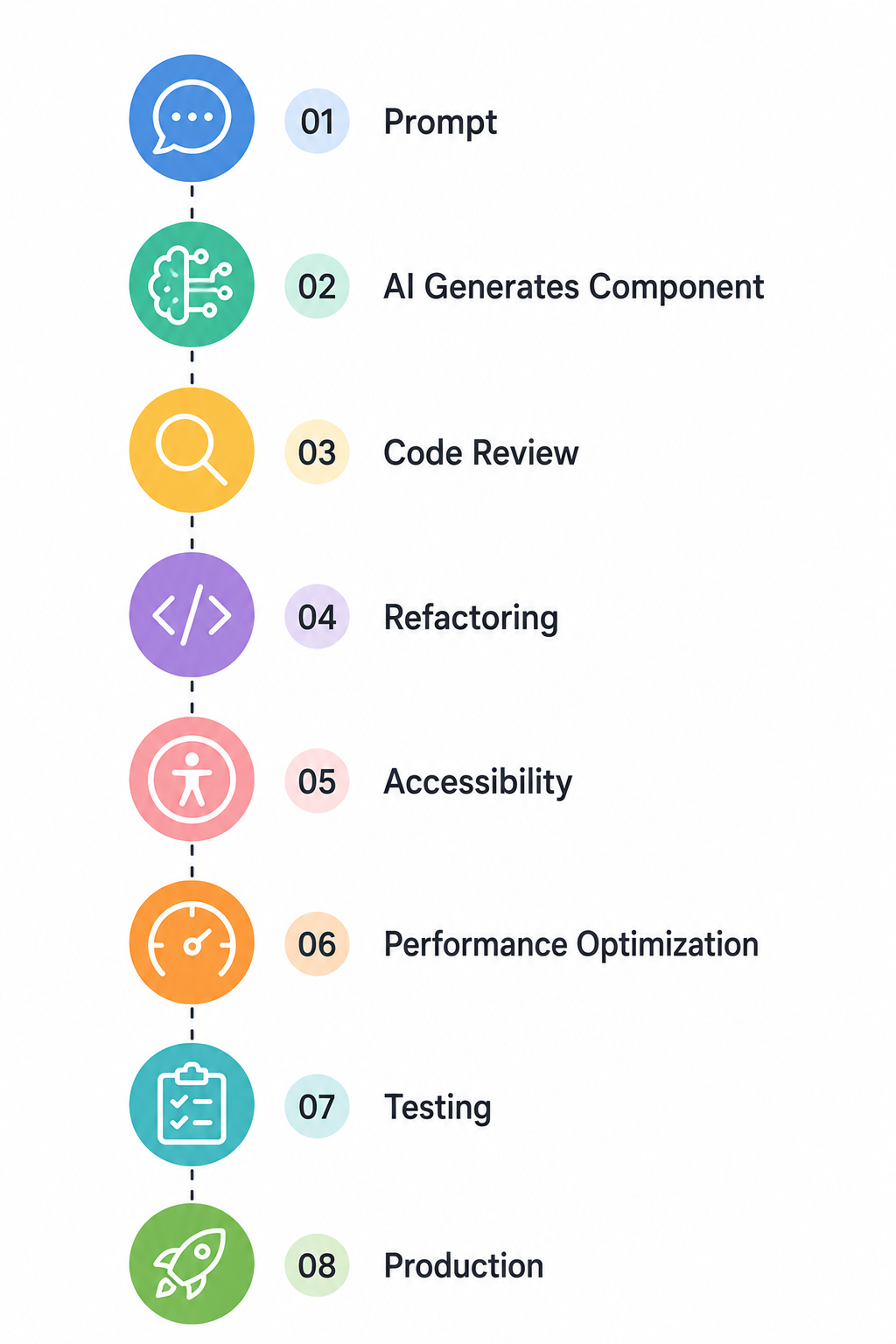
Diagram — AI development workflow
Common problems with AI-generated React code
Some issues I frequently encounter include:
| Problem | Why it happens |
| Duplicate code | AI repeats logic |
| Hardcoded values | Limited reusability |
| Missing accessibility | No keyboard support |
| Large components | Poor separation of concerns |
| Unused imports | Generated automatically |
| Performance issues | Missing memoization |
| Weak typing | Generic prop definitions |
These problems are common and should always be reviewed manually.
AI vs Manual React development
| Feature | AI Development | Manual Development |
| Speed | ⭐⭐⭐⭐⭐ | ⭐⭐⭐ |
| Initial setup | Fast | Medium |
| Code review required | High | Medium |
| Accessibility | Often missing | Better |
| Maintainability | Needs refactoring | Better |
| Business Logic | Limited | Excellent |
| Performance | Needs optimization | Better Control |
| Final production quality | Depends upon developer | High |
Production checklist for AI-Generated React Components
| Checklist | Status |
| Responsive Layout | ✅ |
| Accessibility | ✅ |
| Error Handling | ✅ |
| Loading state | ✅ |
| Type safety | ✅ |
| Reusable props | ✅ |
| Unit tests | ✅ |
| Performance optimization | ✅ |
| Documentation | ✅ |
| Cross- browser testing | ✅ |
Real implementation mistakes we encountered
Real implementation mistakes we encountered
1. Hardcoded API URLs
AI directly inserted API endpoints into components.
Fix: Store URLs in environment variables.
2. Missing loading states
Users experienced blank screens while data loaded.
Fix: Add skeleton loaders and loading indicators.
3. Accessibility issues
Buttons lacked labels and keyboard navigation.
Fix: Follow WCAG accessibility standards.
4. Large components
AI-generated 400–500-line components.
Fix: Split them into smaller reusable components.
Poor state management
Everything was stored in one component.
Fix: Separate UI state from business logic.
Performance benchmark
The following benchmark compares an unoptimized AI-generated component with an optimized production version.
| Metric | AI – generated | Optimized version |
| Bundle size | 82 KB | 55 KB |
| First render | 520 ms | 310 ms |
| Lighthouse performance | 78 | 96 |
| Accessibility score | 74 | 100 |
| Largest contentful paint | 2.9 sec | 1.8 sec |
Benchmark values are representative examples to demonstrate the impact of optimization. Actual results will vary depending on the project.
Code example
AI-generated component
export default function Button() {
  return (
    <button className="bg-blue-500 text-white p-2">
      Submit
    </button>
  );
}
Production-ready component
type ButtonProps = {
  label: string;
  onClick: () => void;
  disabled?: boolean;
};

export default function Button({
  label,
  onClick,
  disabled = false,
}: ButtonProps) {
  return (
    <button
      type="button"
      onClick={onClick}
      disabled={disabled}
      aria-label={label}
      className="rounded bg-blue-800 px-4 py-2 text-white transition hover:bg-blue-700 disabled:opacity-50"
    >
      {label}
    </button>
  );
}
Notice the improvements:
- Reusable props
- Type safety
- Accessibility
- Better styling
- Disabled state
- Cleaner code
Best practices for using AI in React development
To get the most value from AI:
- Write detailed prompts.
- Never deploy AI-generated code without review.
- Follow React development best practices.
- Keep components as small and reusable as possible.
- Test on all browsers and devices.
- Use TypeScript where possible in the project.
- Prioritize accessibility.
- Optimize rendering performance.
- Add proper documentation.
- Treat AI as a coding assistant, not the final reviewer.
Most frequently asked question in FAQ
Conclusion
Production-Ready React Components with AI can significantly improve developer productivity, but AI should be viewed as an assistant than a replacement for engineering expertise. The best results are from combining AI-generated code with thoughtful architecture, code reviews, testing, accessibility improvements, and performance optimization.
As frontend development continue to evolve, developers who understand how to use AI effectively while following React development best practices will build faster, more reliable, and scalable applications. By treating AI as a collaborative tool and refining every generated component before deployment, teams can confidently deliver high-quality production-ready React applications.

